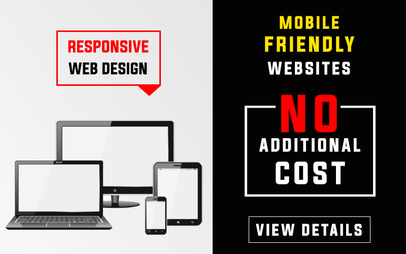
Responsive Web Design is a technique to make a website mobile friendly. Responsive website development helps you make user friendly designs. As a customer you do not have to create two different versions of the mobile and desktop. This is an old story now. These days a single website works just fine on all kinds of devices and screen sizes.If you are looking for a responsive website development company, you can visit our web development proposals.
Benefits of Responsive Web Design
- First of all website adjusts itself depending on the screen sizes
- The website works fine on mobile phone, laptop, desktop and tablet computers. You do not need to create multiple versions of the same site.
- In non responsive you see small text when you open a website on a small screen. In case of responsive design, the user does not have to zoom the page to read text on a mobile screen. The web pages are clearly visible in normal state.
- Customer experience is better in a responsive web design template. Therefore chances of increasing sales online also grow with time.
How we Create a Responsive Website Template
The most noteworthy point here is that all our websites come with responsive design. It is not dependent on price. Therefore, even if you take a low cost website design package, you get a responsive website template. Additionally, the technology is completely dependent on customer requirements.
For example: responsive web design templates will be different for regular website and software applications. Due to this we select technology on the real time basis.
We have a long list of website proposals in the store. Our objective is to make sure customers get most value for their money. Therefore we design beautiful website templates for all our websites. No matter how small or big a website package you take, all customers get the best quality.